
Tuesday, 28 July 2009
Friday, 5 June 2009
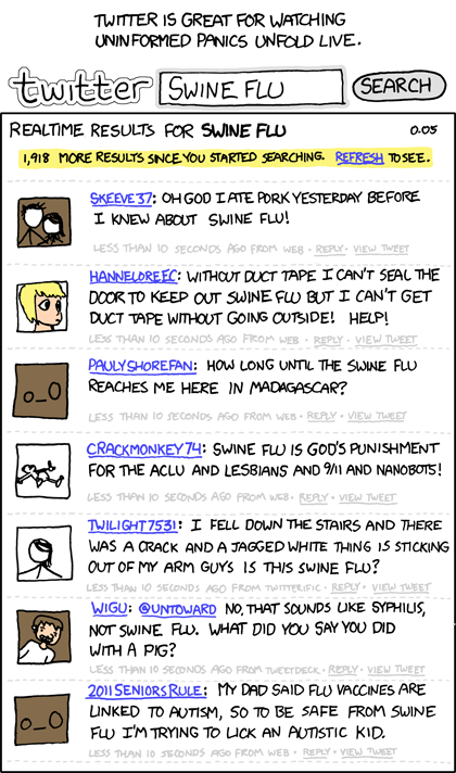
What I want to know
Friday, 22 May 2009
public awareness campagns


Noooooo not Miss Piggy...... Take me instead
MISS PIGGY
R.I.P
Miss Piggy of the Muppets was the first fictional character known to have contracted Swine Flu. She contracted the illness after visiting relatives between the 1980 and 1981 seasons of “The Muppet Show”.
She is known to have infected Kermit the Frog, her physician Dr. Bunsen Honeydew, puppeteer Frank Oz, and Yoda (via Frank Oz).
When Yoda died in Return of the Jedi, it was after a long battle with Swine Flu. Miss Piggy is therefore singlehandedly responsible for the loss of thousands of years of Jedi wisdom from the years of the Old Republic
.

An infection that appears to have lain dormant since the early 1980s appears to have claimed beloved icon Kermit the Frog.
The Aporkalypse


Coughs & Sneezes spread Diseases


NHS advises DIAL 999
In the last 7 days have you:
Do any of the following apply to you?
- I have pain in or across the centre of my chest (see further information)
- I have pain in my shoulder, arm or jaw
- I am severely short of breath and I can't talk in full sentences
- I have swelling around my lips, mouth, tongue or throat
- My lips, fingernails or toenails are changing colour
Please Note: We have further information to help you answer this question
After answering yes
Your answers suggest you need to dial 999 immediately and ask for an ambulance.Call 999
Swine Flu
Wednesday, 25 March 2009
My top Ten
Thursday, 19 March 2009


Gavin Bailey Task 7
Thou shall not advertise…
The role of advertising
Advertising is an essential part of the marketing process. Having designed the product or service for a particular market, got the price right and distribution set up, the promotion or advertising must be done.
It is not simply telling the customer about what you are offering, it is about grabbing their attention and making them want it.
The ethics of advertising
In order to get peoples attention, advertising must stand out from the mundane everyday stream of information we are all subjected to on a daily basis. This means that people who devise advertising campaigns or design advertising materials must sometimes tread a fine line between the shocking and the offensive.
According to Advertising Standards Authority, “the main principles of the advertising standards codes are that ads should not mislead, cause harm, or offend”.
The fact that advertising can not only offend but cause harm underlines how powerful it can be. But, if we think about the advertising which makes the greatest impact upon us and sticks in our minds for longest, it is often that which pushes the boundaries of acceptability.
One company which was considered to push the boundaries is benneton. Examples of imagery used by this company includes: Three bloody human hearts with the words black, white and yellow superimposed on them – an anti racist message in 1966, a priest and nun kissing in 1991, and in 1966 two horses copulating. These images are reproduced below.


Good and bad advertising
Good advertising, if it fulfills its purpose, must be advertising which meets the objective of the advertiser. This usually means that the sales targets are met or exceeded. Most advertising is aimed at a particular target group, a subset of the population for whom the product or service was designed and who are the most likely to purchase it.
However, in order to grab the attention of a particular target group, advertising can and does offend other groups for whom the advertising may not be intended.
It is therefore necessary to take care when advertising in a media form which is accessed routinely by not targeted groups.
Bad advertising, on the other hand, is advertising which does not meet the objectives of the organization which commissioned it. This mainly means that the product or service is not purchased in sufficient quantities to make it profitable.
First Things First a manifesto
First published in January 1964, Ken Garland’s manifesto proclaimed that the talent’s of designers were wasted on the “trivial pursuits” of advertising and that other thing were more worth using our skill and experience on, such as signs for streets and buildings, instruction manuals and a whole host of other, more worthy, applications.
In 2000 Ken Garland renewed his campaign to change the priorities of society away from design consumerism towards more worthwhile uses.
He proposed “a mindshift away from product marketing
and toward the exploration and production of a new kind of meaning”. By this he meant using the visual languages and resources of design for such things as
social marketing campaigns, books, magazines, exhibitions, educational tools
and charitable causes.
However, designers must make ends meet and need to be paid. The sad fact is that consumerism, however trivial, pays our wages and such things as “charitable causes” usually do not.
The best compromise must be to benefit worthy causes whilst at the same time promoting commercial products. Benneton was one of the few companies that shocked people into awareness with brutal images of torture, poverty and social injustice whilst at the same time promoting its company name and therefore its products. People are more likely to purchase products from a company they believe to be socially responsible.
Wednesday, 18 March 2009


Tuesday, 17 March 2009
more logos


Friday, 13 March 2009


Wednesday, 11 March 2009
Card boy


Thursday, 26 February 2009
morals of an ally cat
I also think that CSR goes beyond just caring for the environment but doing whats morally right like in the dvd where it was wrong to fire all those workers and shut the factories. I think as a designer it is our job to make people buy certain products to make people buy into certain brands this is our job this is what we are paid to do. But with this power comes great responsibility"spiderman". Should I as a person advertise for large fashion retail companies that abuse cheap labour in other countries that put profit above human suffering. Should I feel guilty if I do?.
I think as designers we should take some responsibility for how we use are skills or how they are used by others.
I think what it comes down to are morals
i.e. would I design tobacco packaging where the my brief is to make my pack more attractive than all the others so that young people (over 18) bought this brand. Could I do that knowing that I could be shortening peoples lives and introducing cigarettes to people who may not of previously smoked. Or a similar scenario with alchohol.
overall I think this responsibility mainly falls with the companies themselves and advertising standards regulators but I think designers should have consciences on how they influence people.
CSI................. i mean CSR
Corporate Social Responsibility (CSR)
According to our UK government, corporate social responsibility (CSR) is about how business takes account of its economic, social and environmental impacts in the way it operates – maximising the benefits and minimising the downsides.”
Many companies endorse to the principles of SCR but on closer examination we find that, in practice, all they have done is to open discussion forums. These companies include such giants as Intel and Epson. The latter merely stating that part of their CSR policy was to make their product “easy to use”.
One company, Smile Plastics, has based its entire business strategy on the recycling of plastic products. It offers a wide range of plastic products which are innovative, attractive and, above all, socially responsible. One such product is rigid plastic sheets made from recycled mobile phone cases. The batteries and electronic components are removed and the plastic cases used to form the basis of counter tops or tables. Instead of disguising the origin of the recycled materials by finely shredding melting and mixing, this company makes a point of making the distorted shapes of the old mobile cases clearly visible in the material as shown below.
Their other innovations include shredded bank of England notes suspended in clear plastic made from corrugated conservatory roofing sheets and reject car headlamp lenses. They also make sheeting and solid shapes from children’s discarded plastic wellington boots or old bottles.
Their website http://www.smile-plastics.co.uk makes for fascinating reading with images of materials and products made from them.
According to Colin Williamson of smile plastics, “ Every ton of plastics that we recycle saves on average about 1.5 tons of CO2 “
I consider it my personal responsibility as a designer to embrace the principles of CSR and endeavor to minimize the impact of my designs upon the environment. Using and specifying recycled materials minimizes use of energy and the production of greenhouse gasses.
Wednesday, 25 February 2009
Mama Mia ... It's 'a good


Thursday, 12 February 2009


animation
Thursday, 5 February 2009
Huggy.......... The Great Bear


Crazy Shermans ?


AM7/ The Sun Years
Wednesday, 4 February 2009
Monday, 2 February 2009
Response from d&ad winner
MAINCROP
The font was created from a collection of potatoes from the maincrop potato family.
Each potato selected for its shape, then using an apple corer and knife, carefully sculpted and formed to create the alphabet. This was done as simply as possible to create a unity across the letter forms.
Each character was photographed on a wooden board which formed the setting for the pages of the book, as part of the brief was to implement the font. The book then took on the nature of a child's alphabet zig-zag book. Facing pages giving useless and humorless information all related to potatoes, with type held in a silhouette of the potato shape.
This book was held in a mini potato sack. (unfortunately now a bit tattered!)
Friday, 30 January 2009
sorry ur not my type


My bestest belt also has gothic type on it but is not very legible
Thursday, 29 January 2009
Font-tastic Four
 Potato type
I have to write a brief report on a type face we like i remembered this one if u have a spare 2 mins can u tell me about it difficulties incurred technique anything?
i would be most Greatfull
even 3 lines would help me a great deal ( mucho brownie points)
ps r u still doing graphic design
I'm a was a design student in 2002 (many moons ago) and entered the D&AD, think I chose the breif about designing illustrations for zodiac signs. anyway during this exhibition(in london smwhr cant rembr) everyone recieved a D&AD student awards book that featured the best work of students .ur work was in this book I always remembered it and still have the book.
6 years later...
God it is difficult to get a design job so back to uni to do a MA to possibly open up some doors
working on typography brief for uni (not my best subject)
brief ;pick two type faces we like and write an small essay on them.
remembering ur type face in 2002 book thought what better way to find out about a type face than speak to the typographer herself. thru the wonders of facebook.
but if u cud literaly tell me anything about ur work i mean anything how long it took ( the potato type face) any difficulties
whether you were enjoyed doing it. i understand u probly have more pressing things to do with ur time but anyting (1/4 of the size of this mammoth letterr)will do its only a small 2 week brief
Many thanx gavin bailey
