Wednesday, 25 February 2009

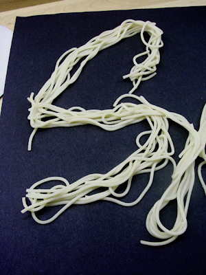
Mama Mia ... It's 'a good


Not being very good at sewing I decided to experiment with something i knew how to work with. It will be interesting to see once the spaghetti has dried how it looks.

Thursday, 12 February 2009


animation


I love this short anime Its all in 1st person its by lobo design group
You actually feel like you are doing the sports involved.

Thursday, 5 February 2009

Huggy.......... The Great Bear

original map
Simon Patterson map ( Turner prize finalist )


Takes a very well known reference point The tube map  first developed y Henry Beck in the 1930's and replaces all station names with a variety of famous names with each line representing a particular category of celebrity.

Crazy Shermans ?

Planet Elvis

By Maik Stapelberg &Daniel Fritz


AM7/ The Sun Years

Elvis did not die he was abducted by aliens, after his music was heard by the alien race when it was sent into out of space aboard the Voyager probe in 1977?

The map above is of the Planet Roosta (the entirely fictional alien planet where elvis now lives)
not only have they made a map  they have made a total graphic manual for this planet showing everything from corporate colour palette and type face to pharmaceutical and food packaging, and maps the entire infrastructure of the civilisation. 

Wednesday, 4 February 2009

MMnn not really that funny but little bit relavant


http://www.collegehumor.com/video:1823766

Monday, 2 February 2009

Response from d&ad winner


I guess I was curious and flattered that this project is even remembered!! Where are you studying? Hope the info below helps - let me know if you need anything else - always keen to help fellow designers - it ain't easy - but keep going - try getting an agent - set commercial projects yourself - write to agencies - become their friend.....all the very best

MAINCROP 

The font was created from a collection of potatoes from the maincrop potato family.

Each potato selected for its shape, then using an apple corer and knife, carefully sculpted and formed to create the alphabet. This was done as simply as possible to create a unity across the letter forms.

Each character was photographed on a wooden board which formed the setting for the pages of the book, as part of the brief was to implement the font. The book then took on the nature of a child's alphabet zig-zag book. Facing pages giving useless and humorless information all related to potatoes, with type held in a silhouette of the potato shape. 

This book was held in a mini potato sack. (unfortunately now a bit tattered!)